Understand the trip.
We compared existing products, mapped users and stakeholders, and identified needs around reservations, alerts, accessibility, and offline information.
Project 01 · Mobile UX case study
A mobile-first guide designed to help people discover parks, prepare for a visit, and reserve a pass—even when planning feels scattered.
The brief
Park information can be fragmented across maps, reservation tools, alerts, and community sources. Our concept brought discovery, accessibility details, safety updates, maps, and park-pass planning into one mobile experience—with offline access in mind for remote areas.
My contribution
As the developer/coder, I focused on functionality and implementation: translating the team's screens into connected prototype behavior, checking that the reservation path worked, and supporting shared research, documentation, and testing.
How we worked together
The process
We moved in four focused stages, learning enough at each step to make the next version clearer.
We compared existing products, mapped users and stakeholders, and identified needs around reservations, alerts, accessibility, and offline information.
Use cases, task analysis, information architecture, and wireflows helped the team agree on how discovery and reservations should connect.
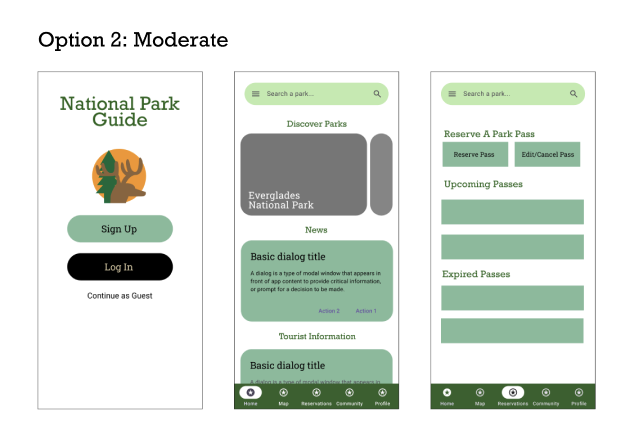
We moved from low- to mid-fidelity screens, then explored three visual directions before connecting the main interactions in Figma.
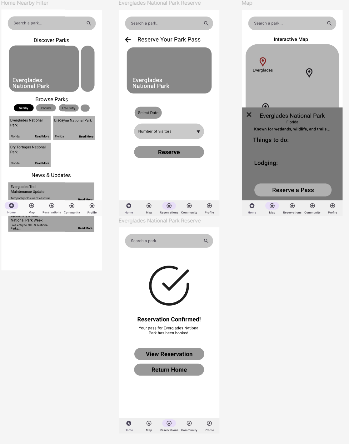
A think-aloud test revealed that the reservation worked, but the destination page was not obvious. We improved its title and active navigation state.
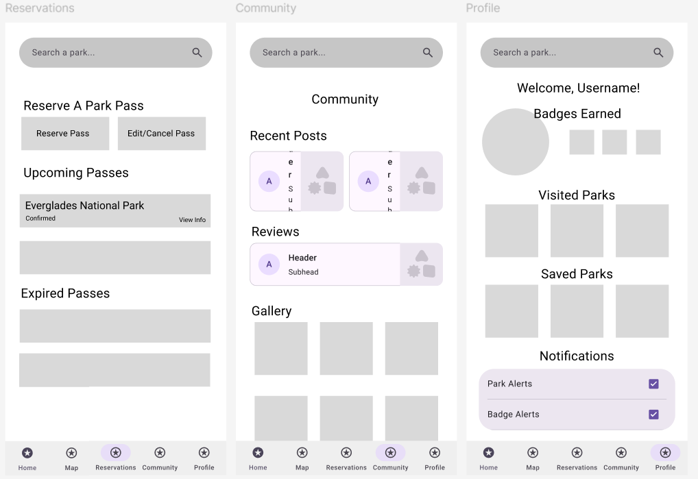
A small change with a clear result
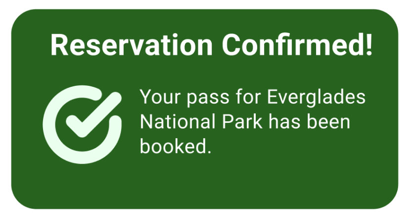
In the first test, the user tapped the Reservations tab again because they did not realize “View Reservation” had already taken them there. We added a visible page title and strengthened the active-tab state, then repeated the same task.
What I learned
Working in a team made the handoff between design and implementation part of the design itself. The clearest improvements came from watching someone use the flow—not from adding more features.
The final review also pointed us toward cleaner typography, more spacing in dense sections, more distinct navigation icons, and clearer labels for the map and community reviews.
Explore the work