Learn what builds trust.
Competitor reviews and interviews showed that shoppers value trusted brands, fair prices, useful product details, and a smooth purchase process.
Project 02 · Product design case study
A mobile app and responsive website concept that helps shoppers find sustainable fashion without losing the convenience of familiar commerce tools.

The brief
Shoppers can struggle to identify sustainable products while also dealing with weak filters and complicated checkout flows. Our concept brought brand discovery, location-aware shopping, item filters, favorites, order tracking, and checkout into a connected experience.
My contribution
As a Product and UI/UX Designer, I helped turn research into user journeys, flows, sketches, and interface decisions. I contributed to both the mobile and web prototypes, then joined the team in testing how people moved through the shopping experience.
How the team collaborated
The process
The team moved from user needs to a shared structure, then tested the experience across mobile and web.
Competitor reviews and interviews showed that shoppers value trusted brands, fair prices, useful product details, and a smooth purchase process.
We focused on filters, nearby sellers, authenticity details, reviews, favorites, order tracking, and a checkout flow that stays easy to understand.
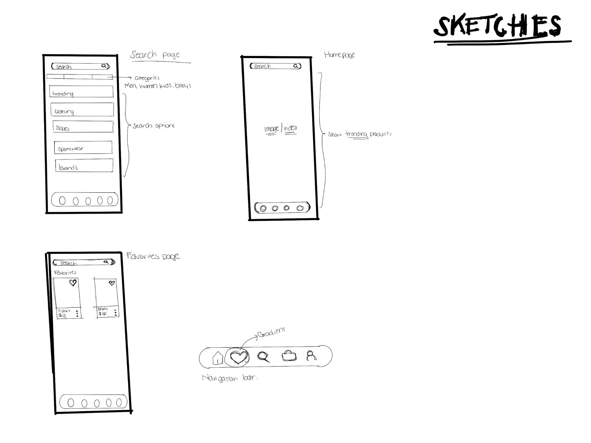
User journeys and flows helped organize search, saved items, cart management, and account tasks before the team moved into wireframes.
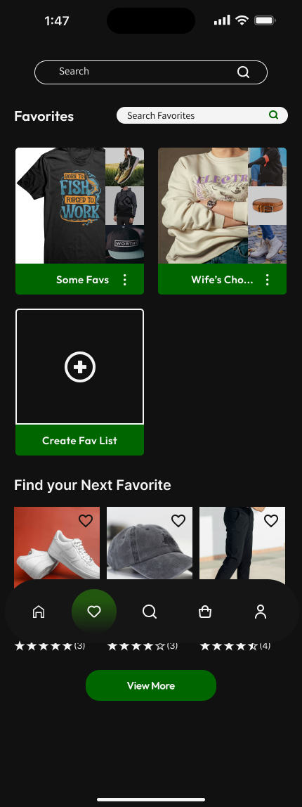
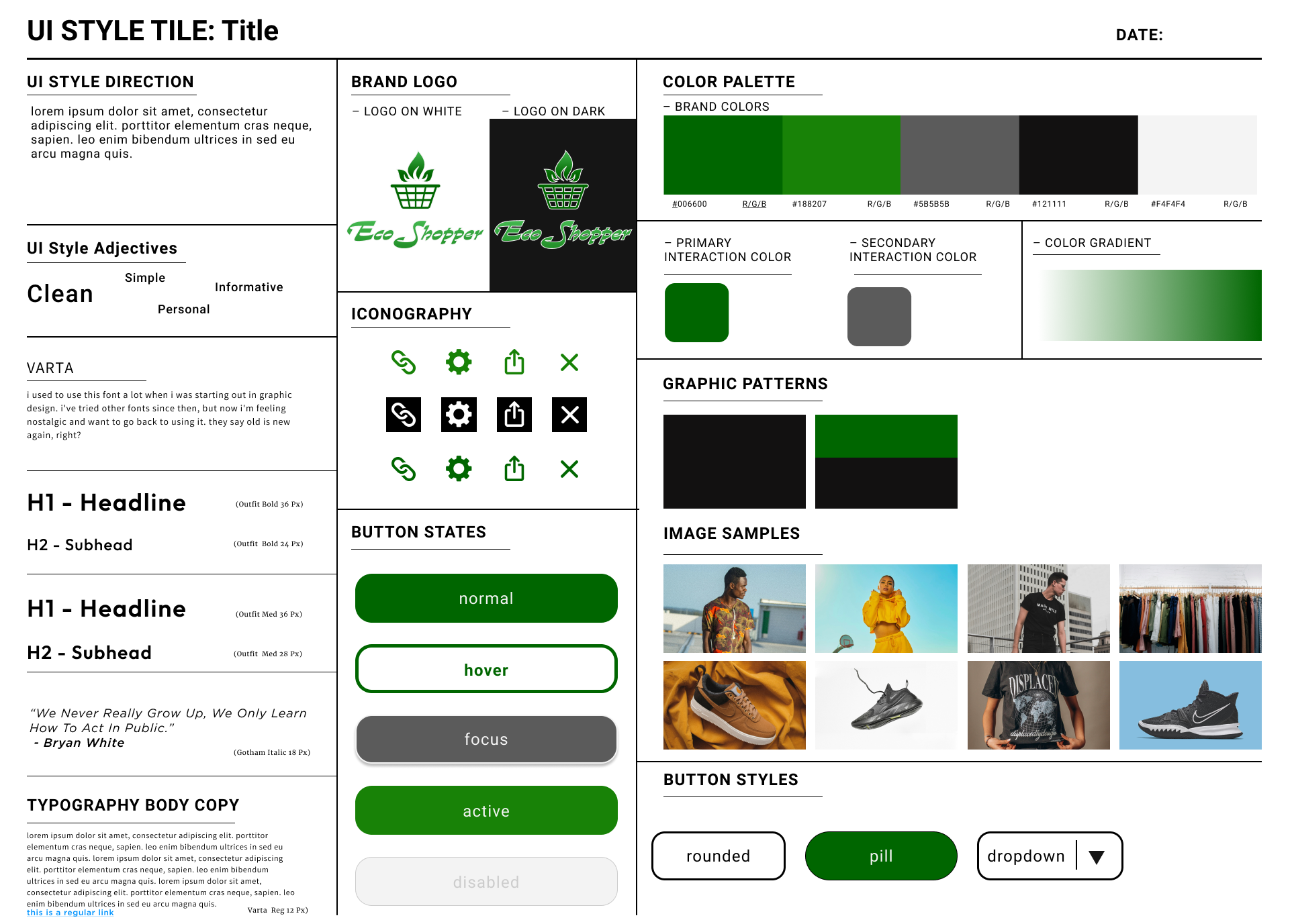
We carried the black, white, and green visual system into high-fidelity mobile and responsive web prototypes, then watched people use them.
Responsive design
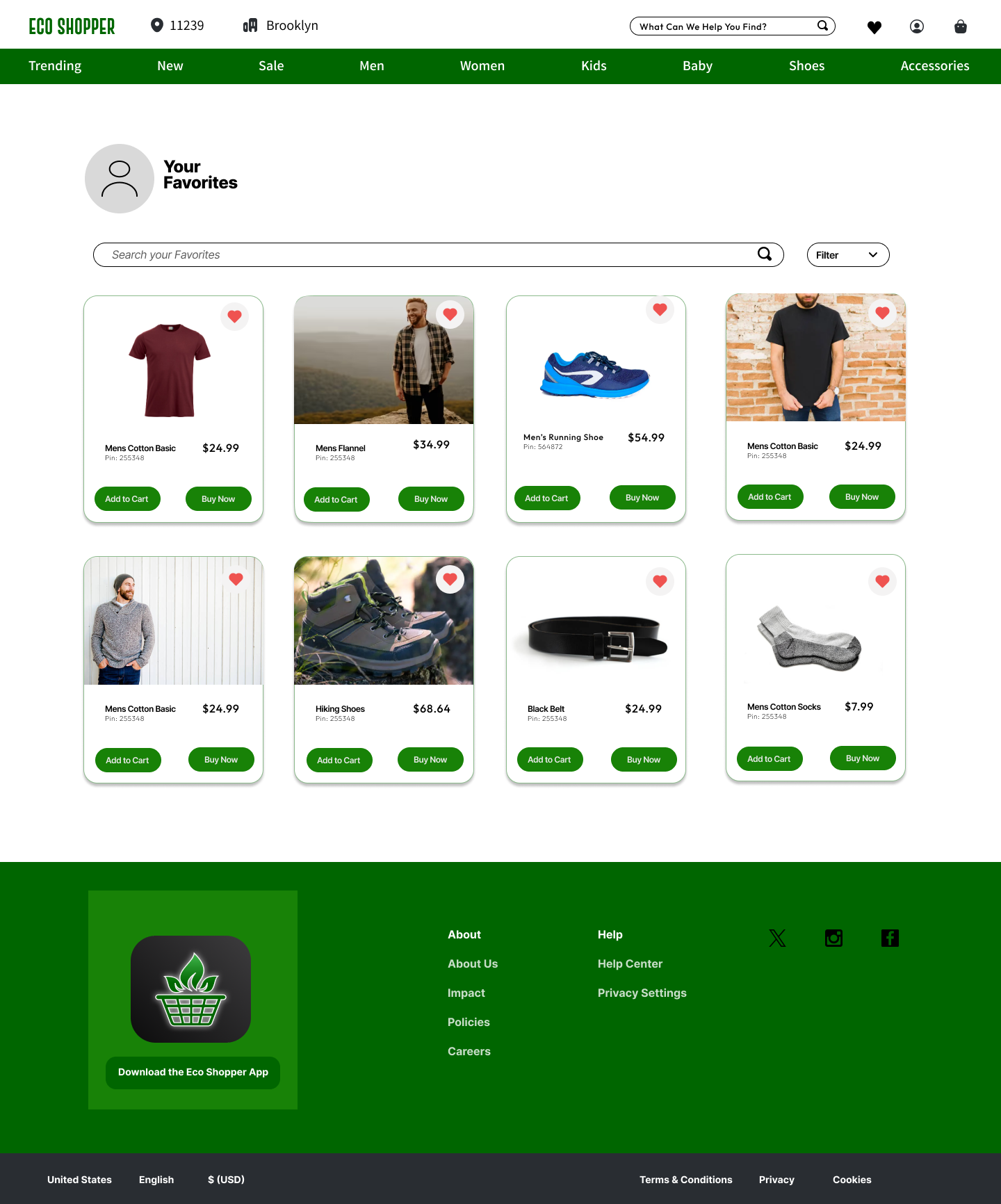
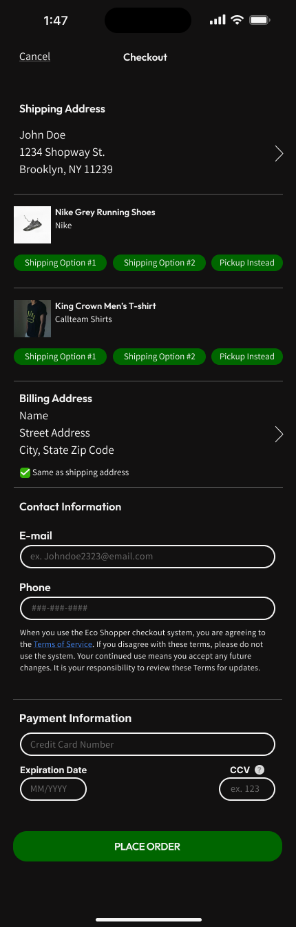
Mobile keeps the next action close and supports quick browsing. The website uses the extra space for comparisons, filters, cart details, and purchase decisions without changing the core product language.
The key usability finding
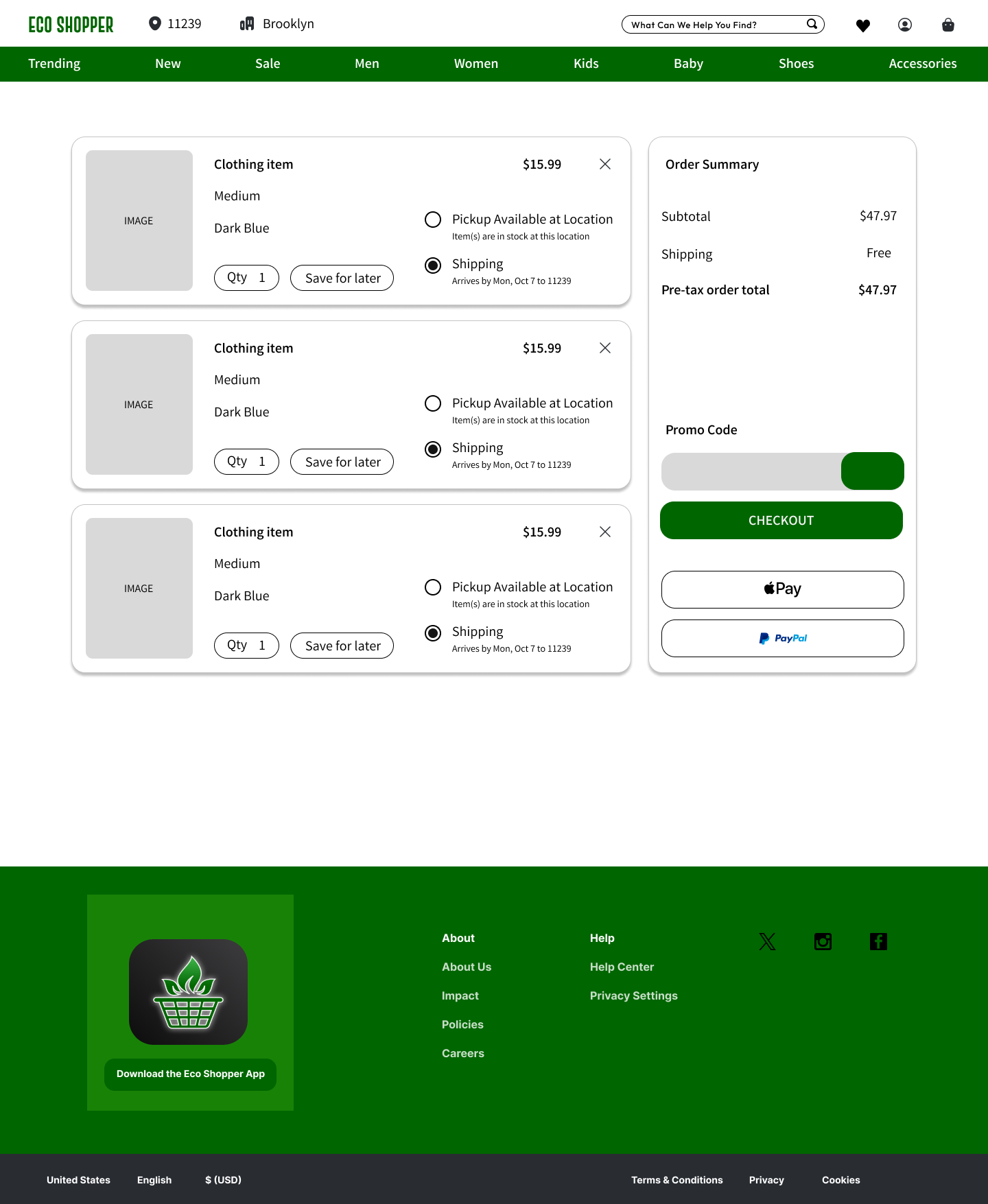
During testing, people used the favorite action on items that were already in the cart when they were ready to check out. This suggested that the cart's actions and hierarchy needed a clearer distinction between saving an item for later and continuing a purchase.
People had already moved into the cart and expected a purchase path.
Make checkout dominant and separate “save for later” from favorites.
What I learned
Designing for two platforms is less about copying layouts and more about preserving the same decisions, priorities, and sense of trust.
Testing also showed that familiar icons do not guarantee a familiar experience. Their placement and timing have to match what the shopper is trying to do in that moment.
Explore the work